mirror of
https://github.com/laurent22/joplin.git
synced 2024-11-24 08:12:24 +02:00
24 lines
1.1 KiB
Markdown
24 lines
1.1 KiB
Markdown
---
|
|
created: 2020-07-08T19:24:44.000+00:00
|
|
source_url: https://www.patreon.com/posts/new-config-is-39113279
|
|
---
|
|
|
|
# New config screen design is ready!
|
|
|
|
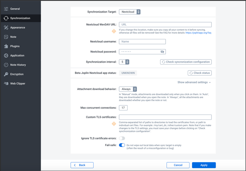
The design put the menu bar on the left, which I think makes sense, as it's consistent with the main screen UI. And I expect this bar will be the same colour as the main screen sidebar
|
|
|
|
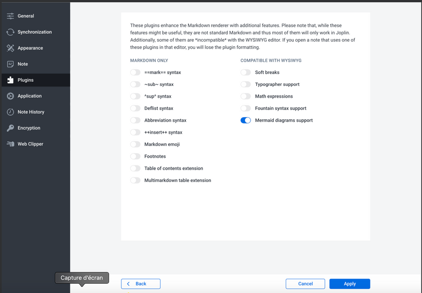
For checkboxes Serj used a toggle button, which actually makes it easier to align all the labels on the left (a checkbox with a label on the left looks strange) so I might go with it.
|
|
|
|
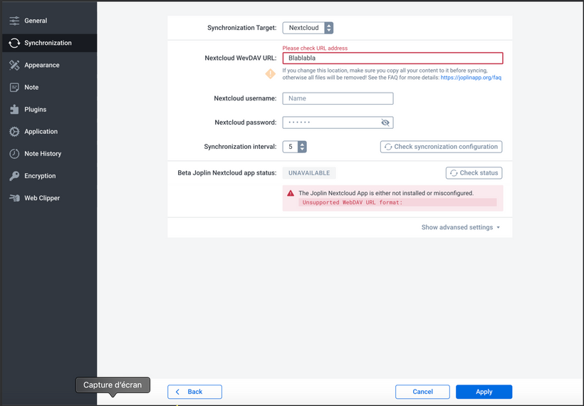
Otherwise the screens are relatively similar but tidier. If you have any suggestion on what could be changed, feel free to let me know.
|
|
|
|
**Synchronisation config**
|
|
|
|

|
|
|
|
**Synchronisation config (error messages)**
|
|
|
|

|
|
|
|
**Plugin config**
|
|
|
|
 |